Enter the password I shared with you to view it.
That's not quite right โ try again.
โ Back to portfolioDesigning faster, more contextual filtering across a Merchant Portal and Back Office for a fintech payment platform.
| Metric | Before | After | Improvement |
|---|---|---|---|
| Filter panel openings to modify a filter | 1 | 0 | 100% โ |
| Filter application steps | 2 | 1 | 50% โ |
| Filter state visible in main workspace | 1 location | 2 locations | 2ร visibility |
| Ways to filter transactions | 1 | 2 | 2ร more entry points |
In a fintech payment platform, users work with large amounts of transaction data every day.
The Merchant Portal allows merchants to manage their payments, view transactions, reports, invoices, company information and other account data.
The Back Office is used by internal teams to manage merchants, approve companies, reconcile transactions, calculate fees, manage groups, thresholds, sweeps and top-ups.
Both products relied heavily on filtering โ but their users had very different expectations.
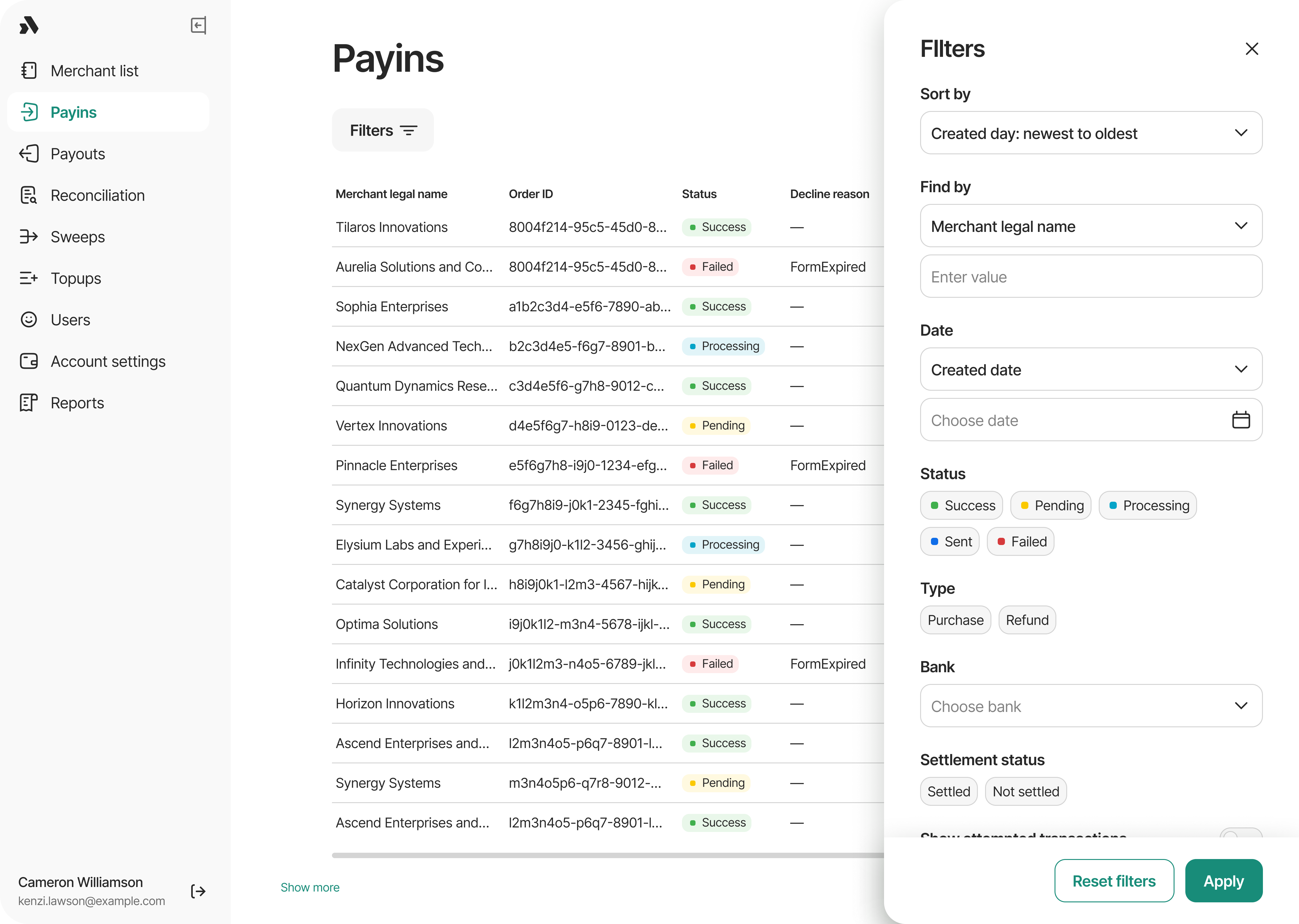
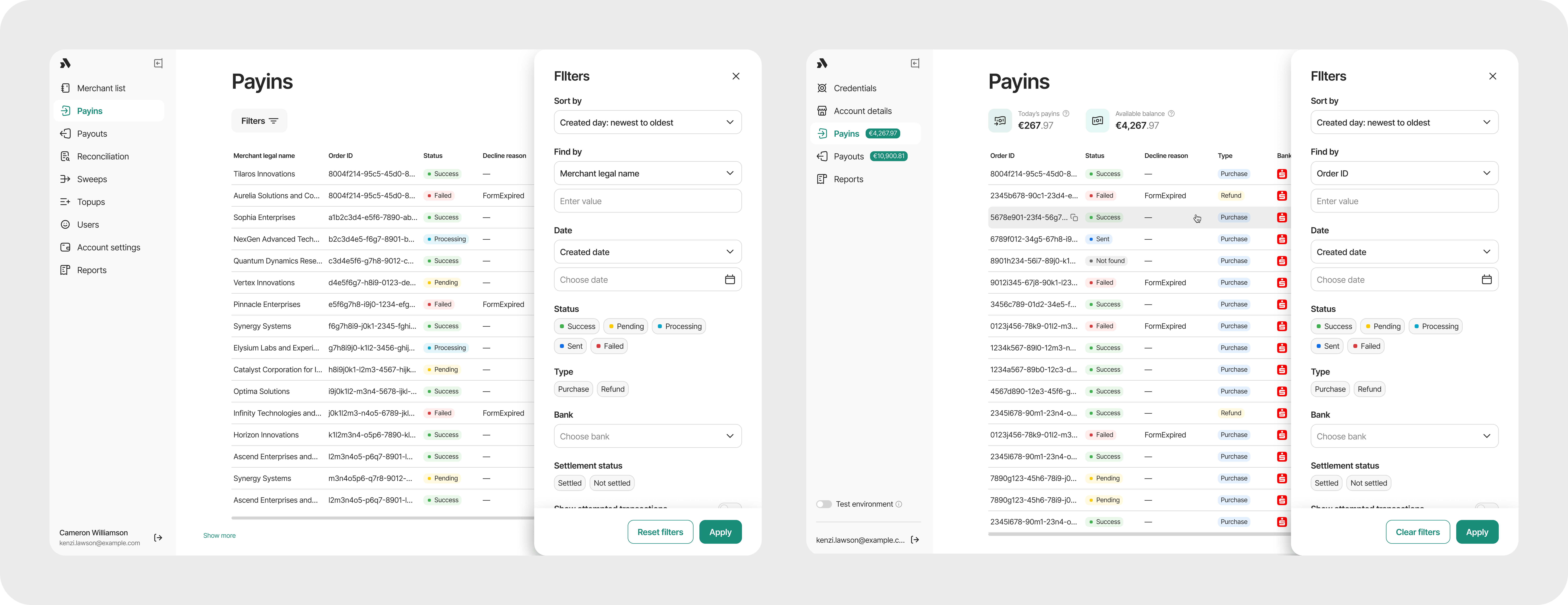
The existing filtering experience required users to open a separate filter panel, configure their criteria, apply the changes and then return to the table. Changing one filter often meant repeating the process.
The goal was not simply to make the filter UI look better.
The challenge was to make transaction filtering faster, more visible and better suited to each product's users and workflow.
The same underlying problem appeared in both products, but the users approached data differently.
Merchants need a familiar, easy-to-understand filtering experience. They shouldn't need to learn a technical query language to investigate their transactions.
Internal users work with large datasets and are more accustomed to technical tools and analytical workflows. They need to combine multiple parameters quickly and repeatedly.
This led to a key design principle:
I was the only designer working on the project. I was responsible for:
I worked closely with the Product Manager, Business Analyst, Engineers and Support team throughout the project.
The project was initiated after feedback from the Support team and merchant-facing workflows highlighted friction with transaction filtering.
I started by understanding how people actually used the Back Office and Merchant Portal, rather than assuming that the existing filter structure was the right model.
I explored how internal users work with transaction data, what they search for and which tools and interaction patterns are already familiar to them.
I focused on real support workflows: finding users and transactions, changing search criteria, investigating failed payments and working with new transactions while communicating with a merchant.
I mapped the current filtering flow and identified repeated actions, hidden context and points where users could lose their working state.
I looked at products and patterns familiar to the team, including Supabase, which uses a more technical filtering model similar to the needs of our Back Office users.
Support doesn't necessarily know the exact answer before starting a search. They may begin with one piece of information, inspect the results, notice something interesting and then add or change another filter.
The existing filter panel treated filtering as a separate step:
This made iterative investigation unnecessarily cumbersome.
During a support conversation, a user may need to refresh the transaction data because new Payins have arrived. Previously, refreshing the page could remove the current filtering context โ meaning the user could have to reconstruct the search they were already working with.
Support may combine several parameters, such as merchant, status and bank. When filters are hidden inside a separate panel, users have to remember what they selected or reopen the panel to inspect it.
This became one of the most important findings. The Merchant Portal serves merchants who expect familiar, visual interactions. Back Office users are more technical and frequently work with large datasets โ they are comfortable with parameter-based search and analytical tools.
The research led to five principles that guided the redesign.
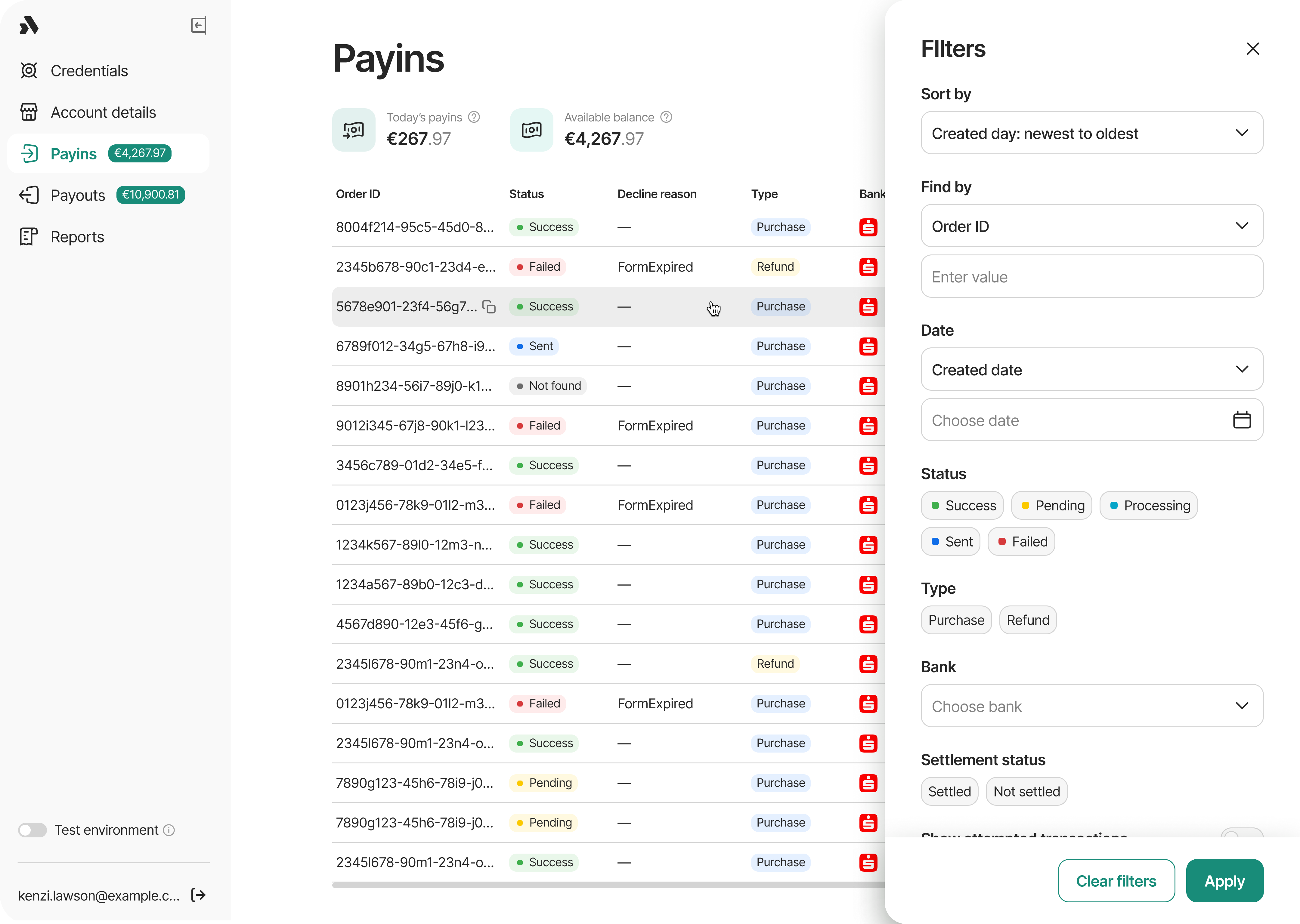
The Merchant Portal used a large filter panel. The user had to open the panel, configure the criteria and click Apply. When they wanted to change something, they had to open the panel again. The table was partially covered while the filter panel was open, separating the act of filtering from the data being investigated.
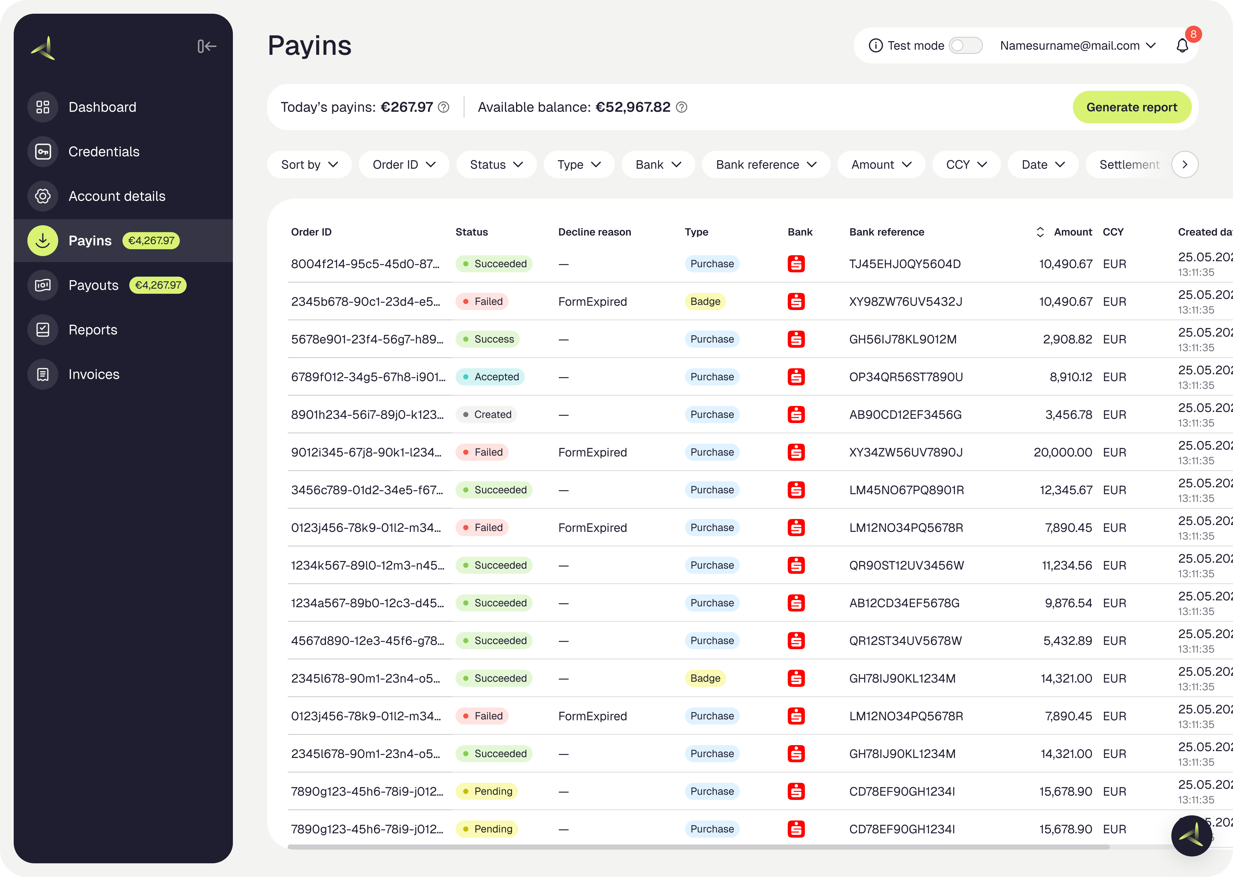
I moved the filtering experience directly above the transaction table, combining filter controls, active filter chips, sort, individual filter removal, multi-filtering and table-level filtering opportunities into a filtering workspace that stays connected to the data.
In the previous experience, selected filters were shown as chips below the table after the user applied them. However, changing those filters still required reopening the filter panel.
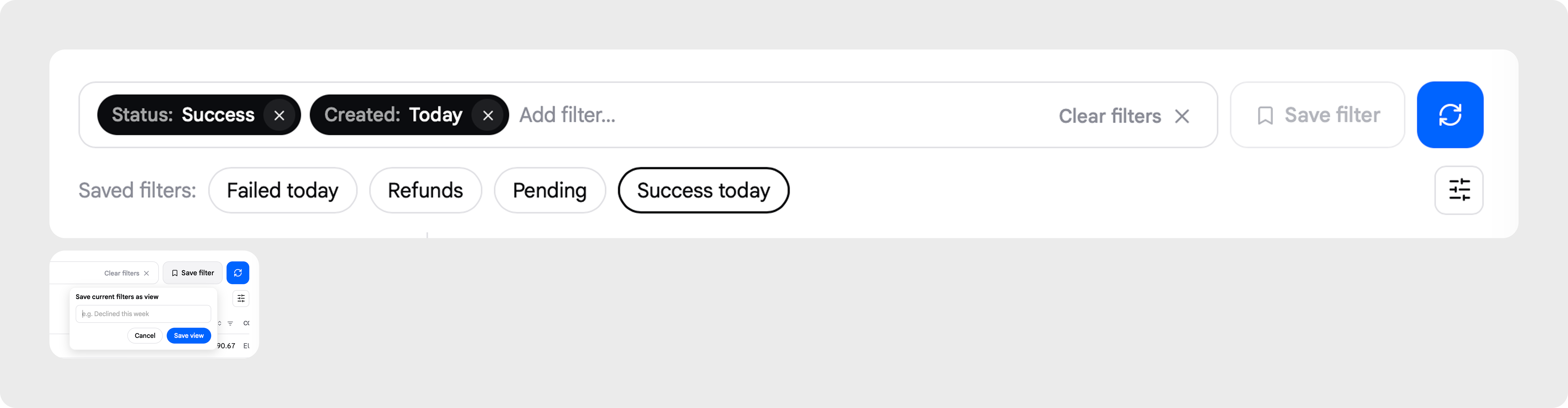
In the redesigned experience, the active filter state is brought into the main filtering bar above the table, where users can immediately see and modify their criteria. For example:
This creates a more direct relationship between the filter state and the transaction results, while reducing the need to repeatedly open and close the filter panel.
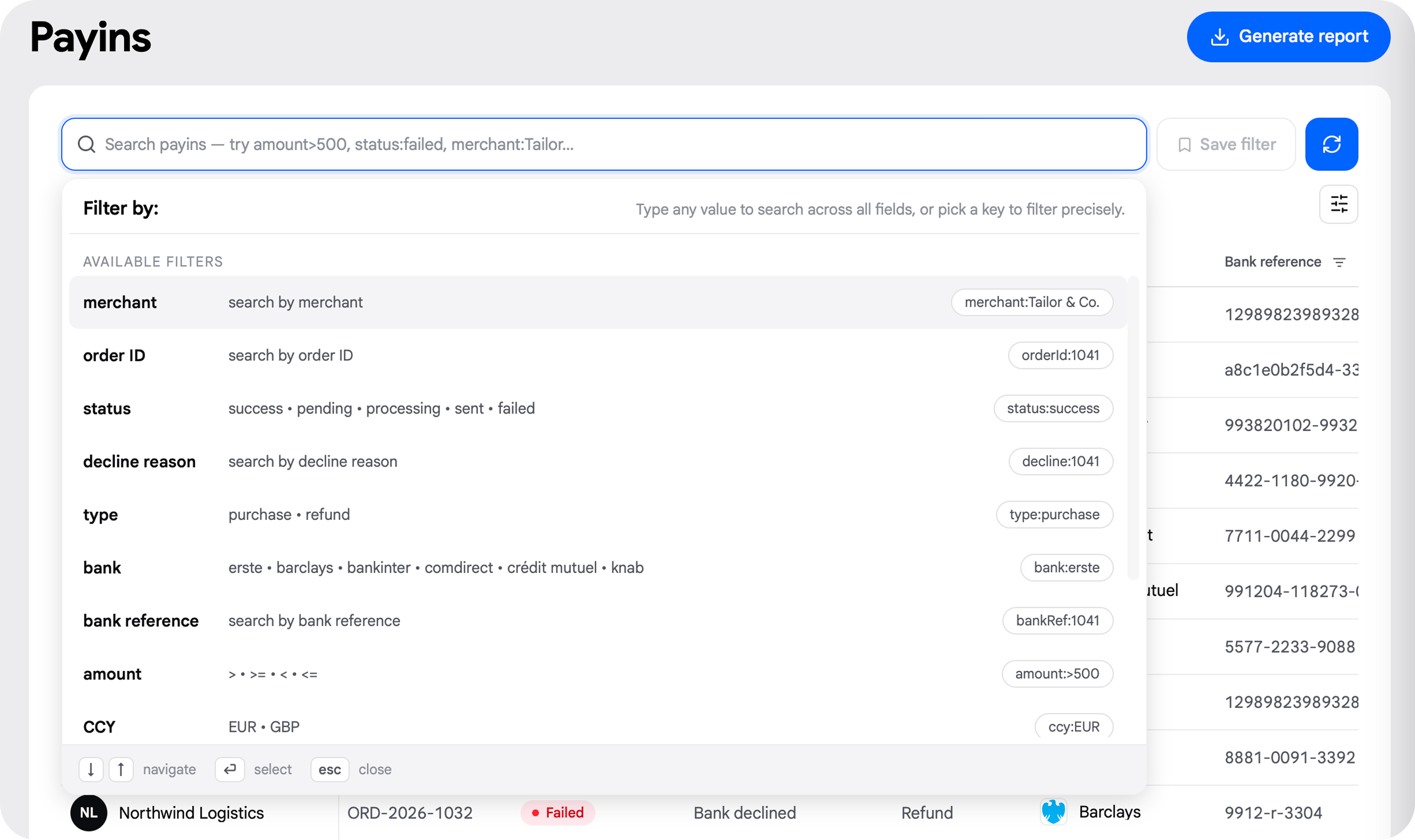
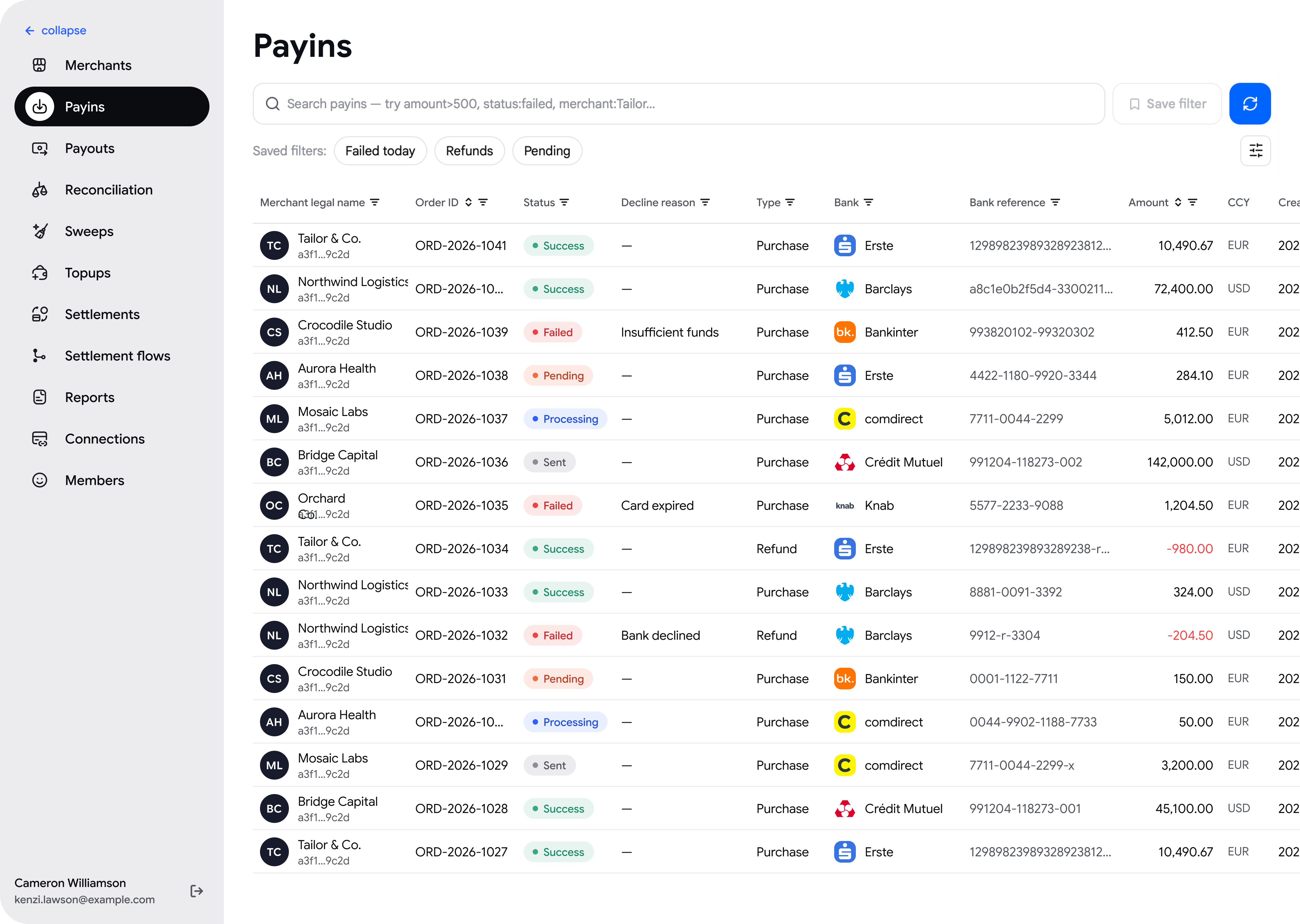
The Back Office needed a different approach. Rather than moving the Merchant Portal filter pattern directly into the Back Office, I designed a search-first filtering experience. The main interaction became a query-style search field:
Users can build a query using keyboard or mouse interaction, while the interface suggests available parameters and values. This makes the filtering experience closer to the analytical tools and workflows already familiar to technical users.
| Metric | Before | After | Improvement |
|---|---|---|---|
| Filter-panel openings to start a search | 1 | 0 | 100% โ |
| Saved filter presets | 0 | 3 | New capability |
| Filter context lost after refresh | Yes | No | Context preserved |
| Data refresh scope | Full page | Table only | Scoped, not full-page |
| Filtering entry points | 1 | 3 | 3ร more entry points |
This was a deliberate product decision. The products share the same principles, but the interaction model is adapted to the audience.
| Merchant Portal | Back Office | |
|---|---|---|
| Primary users | Merchants | Internal / technical users |
| Mental model | Familiar visual controls | Technical / analytical |
| Main pattern | Filter chips + dropdowns | Query-style search |
| Priority | Discoverability | Speed and flexibility |
| Interaction | Select values visually | Build a query |
| Additional capability | Contextual table filtering | Saved queries + column filtering |
I also introduced saved filters in the Back Office. Common searches can be saved and reused, for example:
This is particularly useful for repetitive operational workflows where users repeatedly investigate similar transaction sets. Instead of reconstructing the same query each time:
Another important improvement came directly from Support's workflow. New Payins can arrive while a support agent is investigating a case. Previously, the user could refresh the entire page, which risked losing the filtering context.
I introduced a dedicated table refresh action in the Back Office. The mental model becomes:
The Support team identified the need for fresh data; my contribution was translating that requirement into an appropriate interaction and placing it where it would be easy to access without disrupting the workflow.
My involvement continued beyond the Figma designs. I worked with Engineering during implementation and performed design acceptance to make sure the final product matched the intended interactions and visual design.
I also created an interactive prototype that allowed the filtering interactions to be explored and clicked through before implementation โ this helped communicate not only how the screens should look, but how the filtering system should behave.
The redesign moved filtering from an isolated interaction into the user's primary transaction workflow.
The redesigned filtering experiences were fully implemented across the Merchant Portal and Back Office. The main outcome was a shift from a form-based filtering model toward a more contextual and workflow-oriented model.
The biggest lesson from this project was that filtering is not just a UI component. It is part of how users investigate information.
Initially, the problem could have been solved by simply redesigning the filter panel. But looking at the workflows revealed a bigger opportunity: filtering could happen closer to the data, and different users could benefit from fundamentally different interaction models.
The Merchant Portal became more visual and contextual. The Back Office became more technical and efficient. The common principle was simple:
The most valuable design decisions were the ones that made filtering feel less like a separate action and more like a natural part of investigating transaction data.